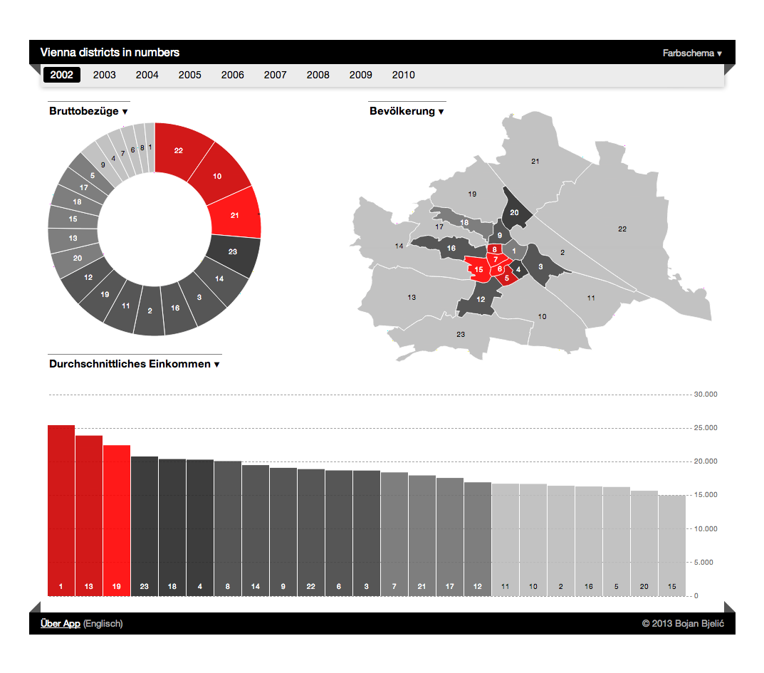
Vienna districts in numbers is an data visualization application, written in JavaScript, based on the open data. Here’s a bit about how this came to be.
Data visualization
I am very much fascinated by the various ways we can represent data.
Looking at the raw data offers some insight, but often the relationship and ratio remains abstract.
The visualization makes it much more present and alive. Especially when it’s possible to interact with it.
The apps4austria contest organized by the Austrian state was a chance to try out some representation and interaction ideas based on data about Vienna.
Vienna districts
Different parts of any other big city have different offerings, and often you can feel as in a completely different city or country.
I feel that districts have a special role in Vienna – the inner city is a part of UNESCO World Heritage, the districts are separated by the Danube river, the Danube channel, big road rings, and so on. Every street sign has a number of the district in front of the street name.
Since the city of Vienna is the part of Austria I know best, I decided to explore this data and learn something more about the city I live in.
apps4austria contest entry
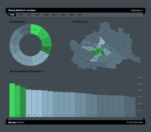
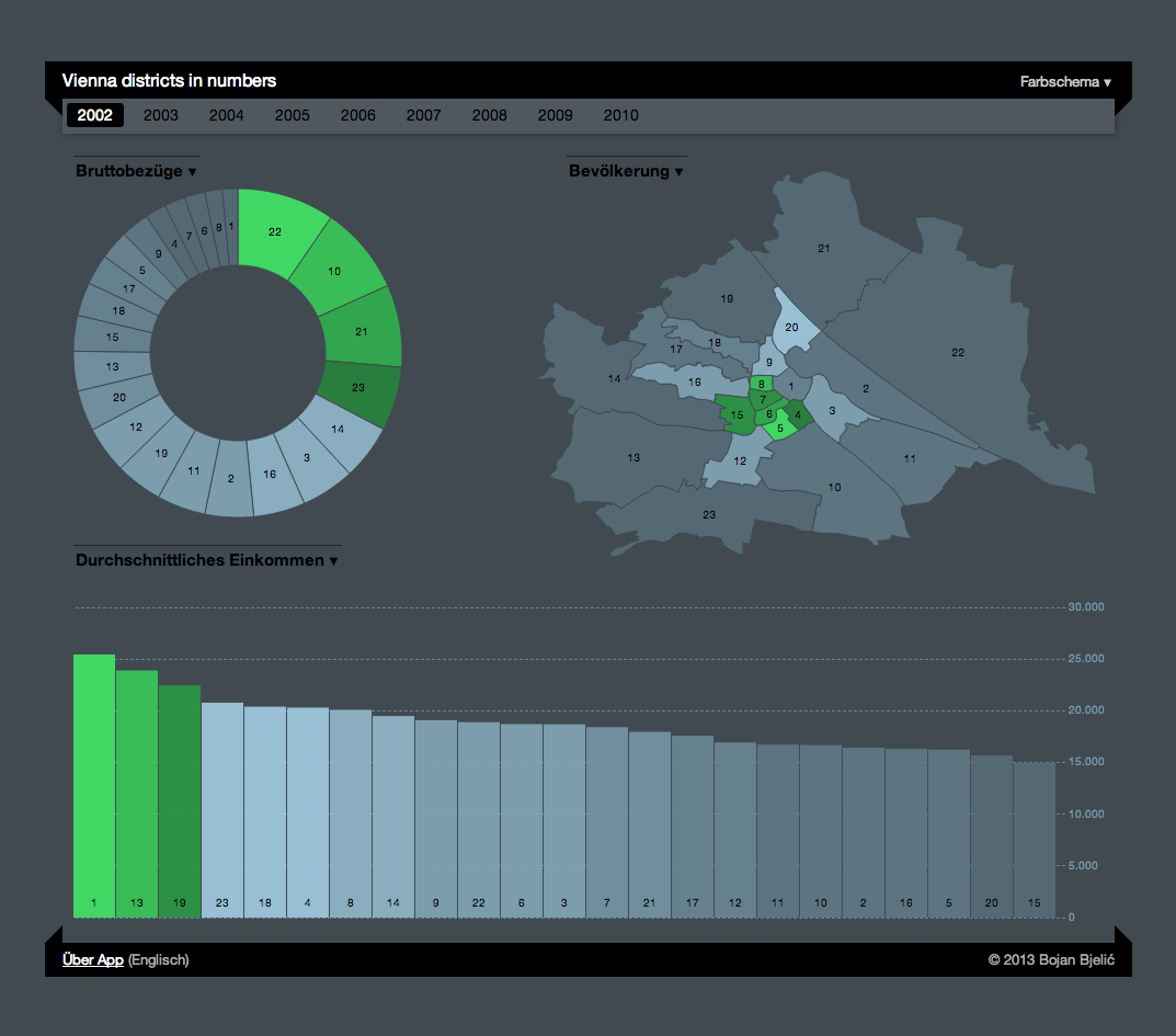 Vienna districts in numbers is a web-based application, running in the browser. Tested in Google Chrome (version 23), Firefox (version 19), and Internet Explorer (version 9).
It is written in JavaScript, together with HTML5 for markup and CSS3 for styling.
The excellent D3 library is used for representation and manipulation. The imagery is rendered in the SVG open format.
Austria has various public data available on the Offene Daten Österreich website, and city of Vienna has a subset on the Open Government Data (Offene Daten für Wien) website. I used data sets on income, population, and the district borders. These had to be processed a bit to confirm with number formats and data format standards.
About the data
Income
Here is the information page for the income dataset: Lohnsteuerstatistik für Wien: Zeitreihe
Based on the downloaded file, w09-incometax-vie-dis.csv I have produced w09-incometax-vie-dis-fixed.csv with the following changes:
- removed header
- removed thousand delimiters (“.”)
- date formatting
- replaced semicolon “;” with a comma “,” so the library can load Comma Separated Values
Population
Here is the information page for the population dataset: Bevölkerung in Wien: Bezirk – Geschlecht
The provided file, w09-incometax-vie-dis.csv had to be changed in the following way:
- removed header
- date formatting
- date rewriting (01.01.2003 = 31.12.2002, data is for the previous year)
- replaced semicolon “;” with a comma “,” so the library can load Comma Separated Values
Map
The map data is provided here: Bezirksgrenzen
It’s already in the JSON format, but it wouldn’t render properly unless the polygons ordered clockwise, so I’ve converted the data to TopoJSON.
Tools
D3 – Visualisation, data loading. d3js.org, GitHub (source code)
TopoJSON – Data conversion, data loading. GitHub (source code)
Google Docs – Documentation, data overview. Google Drive
Outcome
The contest results will be published in the second quarter this year.
Regardless of how it does in the contest, I’m very satisfied how it turned out and with what I have learned through the process.
The visualization is available in English and German.
Hope you like it, and I would be very interested to hear your comments.
Leave a Reply